As a print shop that deals with a high volume of clients with all sorts of backgrounds, you’d better believe that we’ve seen all sorts of print projects come through our shop. From signage to stationary, we’ve seen it all, and thought it would be helpful for us to share what we’ve learned from our years in the biz to help you avoid the 4 most common design mistakes and make the design process less daunting. Through helping our clients come up with great projects over the years, we’ve compiled a list of “don’ts” to help you in the early stages of your design that will result in great looking products!
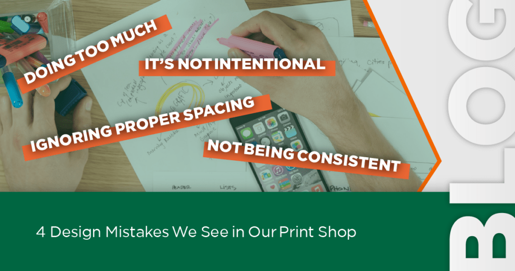
Design Mistake #1: Doing Too Much
It can be exciting to have a blank canvas in front of you with so much potential. You might be thinking that this is the perfect opportunity to tell people all about your business and the services you offer. Why not throw in some photo examples? Maybe use some bright colours to highlight your most important information?
That would be a mistake.
One of the worst things you could possibly do for your design is to overwhelm it with too many visual and textual details, which brings us to the following points:
Don’t Make it Too Wordy
You really don’t need too many words to communicate what you’re all about. Often a short, bulleted list or brief but clear text is enough to convey your message. Make sure that if you do include more text than your company name and a simple tag line that it’s in an appropriate medium for that kind of promotion, like a brochure. Otherwise, you want to let your brand speak for itself as much as possible and direct people to your website, social media, or to call you for more information.
Don’t Use Too Many Different Fonts
While using a different font to highlight certain key points is an effective way to differentiate pieces of text and draw the readers attention, you want to be careful about using more than 2 or 3 different fonts. Overloading your design with too many fonts will make your design look disorganized and disturb the visual harmony. Using a bold or italicized version of your font is a great way to distinguish text while keeping it in the same family.
Don’t Use Too Many Elements
This goes along with the idea behind limiting how many font styles you incorporate into your design. The last thing you want to do is end up with a cluttered, busy design. The ultimate goal is to promote your business and having too much going on is the easiest way to distract your audience. Keep it clean and simple with your logo, company name, or a catchphrase and use your signature brand colours to distinguish yourself.
Design Mistake #2: It’s not Intentional
You’ve been meticulous about every detail leading up to the development of your business so far – your promotional designs deserve the same attention. Being intentional about the placement of text, elements, and colours in your designs makes a huge difference to the overall look of your products. It doesn’t take long to make sure that text is centered and that everything makes sense visually, and the results are well worth it.
Design Mistake #3: Ignoring Proper Spacing
Negative space is the key to keeping your designs sharp, clean, and easy to read. Consider the margins of your design and the spacing between elements and letters to make sure that things aren’t too crowded.
Design Mistake #4: Not Being Consistent
Consistency is the key to successful branding. Not only do you need to make sure that you are following your brand guide, but you need to make sure that everything is consistent within your existing design, i.e. everything that’s supposed to be the same size has been checked, spacing is consistent, and all the little details match up.
Post Press
Keeping these helpful tips in mind, you’ll be coming up with fantastic designs in no time! We look forward to seeing what you come up with and can’t wait to help you bring your vision to life!
Why wait any longer? Contact us today for a quote!