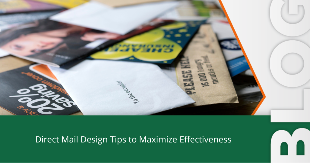
There are dozens of distinct types of direct mail design formats to choose from, including catalogs, postcards, envelopes and letters, brochures, greeting cards, newsletters, and more.
And designing each type of direct mail has key differences to consider. For example, when designing your catalog, you need to account for the different pages. For brochures, you need to take into consideration the type of fold you are designing for.
While there are specific design factors that come into play for each different type of direct mail product, there are overarching things that never change. And to ensure an effective direct mail design, no matter if you’re designing a postcard or catalog, these direct mail design tips will help you launch a successful direct mail campaign.
7 Direct Mail Design Tips to Maximize your Next Campaigns
1. Know Who Your Audience Is
Direct mail campaigns are typically sent to existing customers or a new audience, and no matter what, you need to make sure your direct mail pieces are designed for your specific target audience. You need to understand what your audience wants and what they are interested in so you can better design your direct mail pieces in a way that persuades them to act. For example, what offers will your audience respond to. What kind of images reflect who they are? What tone and style will they resonate more with?
When you know who you’re targeting in your direct mail campaign, you’ll be better able to design an effective direct mail message.
2. Consider the Copy Carefully
The copy within your direct mail design should be clear, concise, tailored to your target audience, and it should be organized well. Direct the copy to your audiences’ interests; for example, if you’re promoting your restaurant, what is important to your audience? Could it be your family friendly atmosphere or your unique and international dishes? Whatever is important to your target audience, from the tone to the actual words, you want to include it within your copy.
You also want to make sure your copy is clear and gets straight to the point. You have less than 5 seconds to grab your audiences’ attention when they first view your direct mail piece, so you want to be careful not to include too much text that may turn the reader away from your message.
3. Stick to Your Brand Guidelines
Follow your brand guidelines within your direct mail design. And don’t forget to include your logo!
Brand guidelines are a set of rules and standards that need to be followed to ensure your brand is being represented consistently. And they should be followed throughout all marketing channels, including direct mail. If your company uses a certain tone, whether playful or serious, or if your brand has a set typeface you use for all printed materials, website content, and digital marketing collateral, then you should use that tone and typeface in your direct mail design as well.
This goes for colours, icons, image formatting, and style as well. The goal is to have all your marketing materials, and other branded content united so that it strengthens your brand and so that no matter if someone is looking at your postcard, poster, or display ad, they know it’s you.
4. Use Imagery That Reflects Your Message
Once you know who your audience is, and have the messaging down, you want to choose imagery that reflects both. For example, if you’re including images of people, choose ones that include people who are around the same age as your audience. If you’re a family-oriented business targeting families, include an image of a family, or if you’re targeting people with pets, include images of people with their pets.
The imagery you choose to include within your direct mail design, of course, should be of high quality with a resolution of at least 300 dpi to ensure crisp printing of your imagery, but it also needs to reflect your audience and your message. For instance, if a credit union was promoting their auto loan services, they could use an image that has a car in it, while their direct mailer that promotes their low-interest home equity loans could include an image of a family in their home.
This may sound like an easy decision, but it’s so important to remember within your direct mail design because images are often the first thing people notice, which means your images need to quickly grab your recipient’s attention and attract them to read more.
5. Use Negative Space and High Contrast in Your Direct Mail Design
When it comes to design in general, whether for a sign, a digital advertisement, or direct mail, you always want to include contrast, negative space and/or white space. This doesn’t mean you need to include the actual colour white; instead, you want the background of your design (whether black, red, or blue) to balance and break up the design elements. This will make it easier for your audience to read and absorb the information you are sharing with them.
What is the first thing you want your audience to look at? What is the most important part of your direct mail design? This may include your headline or image, and it will always include your call to action. Whatever it is, you need to use contrast to draw attention to your most important design elements. Using sharp contrast in your direct mail design not only drives attention to vital information but it also makes your direct mail stand out and makes it easier for your audience to read.
Also, when you use negative space successfully or contrast colour elements, it can help highlight and bring attention to your most important direct mail design elements. For example, make sure to include a good amount of negative space around your call to action or CTA—like a frame bordering your CTA.
6. Personalize Your Direct Mail Pieces
When you’re designing your mail piece, it’s very important to account for your overall audience, but what about each individual recipient?
When you customize each individual direct mail design to reflect each recipient, you can increase your response rate by 135%.
Plus, it’s easy to do! With Variable Data Printing you can easily and affordably create personalized designs for everyone who is receiving your direct mail piece. This includes names, images, colours, and more so that not only does your direct mail design reflect who your audience and brand is, but it also is personalized for each recipient.
7. Include a Call to Action (CTA) That will Promote Action
A good strategy for your direct mail design is to start backwards. What does success of the campaign look like? How do you want them to get a hold of you? Then, include a call to action your audience can’t refuse that meets the answers to those two questions.
When you offer something, like a freebie or deal, it makes it hard for your audience to ignore and gives them even more of a reason to take you up on your offer. When you do provide your audience a reason—other than your fantastic products and services—then it intrigues and excites them. The unrefusable offer is the first step.
Include the details for how you want them to respond to you. You must include a phone number, email, URL, QR code, etc. so they can get a hold of you.
You need to track them when do respond. Consider a unique landing page, a phone number specifically for the campaign, or an alias email used solely for this direct mail campaign.
Post-Press
Direct mail is an effective and profitable tactic for many businesses just like yours. Looking for a local printing company that specializes in direct mail design, mail production, print and delivery to Canada Post? At Minuteman Press Calgary Shepard, we stand out from the rest. Trust us to manage your project from start to finish. Ready to get started? Request a Quote today to learn more!
3 additional articles from Minuteman Press Calgary Shepard on Direct Mail:
Best Friends: Direct and Digital Marketing Better Together
6 Inexpensive Ways You Should Use Print to Bolster Your Word-Of-Mouth Marketing